When developing web applications, keeping the interface clutter-free and organized is essential for a seamless user experience. In frameworks like Vue.js, where flexibility meets powerful design, PrimeVue emerges as a leading UI component library. Among its many features, the Anchor Panel stands out as a versatile tool for organizing content efficiently. This article dives into the essentials of the Anchor Panel in PrimeVue, explaining how it works, why it’s useful, and how it can elevate your content strategy.
The Anchor Panel in PrimeVue enhances content organization with collapsible and dockable sections, offering seamless control and responsiveness for a better user experience.
What is the Anchor Panel in PrimeVue?
The Anchor Panel is a UI component in PrimeVue, designed to contain and manage various types of content within collapsible panels. Acting like a sectioned box, it ensures neat presentation by allowing users to expand or collapse individual content sections as needed. This helps developers provide a tidy and intuitive layout even when dealing with large or dynamic datasets. Whether used on dashboards, forms, or menus, the Anchor Panel plays a critical role in enhancing user interaction.
Why Use Anchor Panels for Panelling?
If you’re managing complex layouts or extensive content, anchors for panelling become a game-changer. Here’s how the Anchor Panel in PrimeVue helps developers keep the user interface clean:
- Improves UI Organization: It structures content into manageable parts, avoiding the clutter associated with long web pages.
- User-Friendly Navigation: Users can focus on relevant information by collapsing or expanding sections based on need.
- Customizable Design: Developers have full control over the headers, footers, icons, and panel styling.
- Responsiveness Across Devices: Anchor Panels adapt perfectly to different screen sizes, offering optimal layouts on both mobile and desktop devices.
Key Features of Anchor Panel in PrimeVue
Collapsible Panels
- Users can expand and collapse sections with a click, which keeps the content easy to manage and improves readability.
- This feature is especially useful in dashboards or FAQ sections where only a subset of information may be required at a time.
Dockable Panels
- Anchor Panels can be docked to any side of the screen—left, right, top, or bottom—which is handy for building sticky toolbars or navigational menus.
Interactive Elements
- The panels support buttons, icons, and animations that allow interactive use, such as opening/closing triggers and actionable links.
Customization Options
- Developers can customize each panel’s header, footer, or content area to match the application’s design. This makes the Anchor Panel a great fit for dynamic web applications that need flexible layouts.
Also Read : How to Activate eSIM on iPhone Quick and Easy
How to Implement Anchor Panel in PrimeVue
Implementing the Anchor Panel in a Vue.js project is simple, especially if you already have PrimeVue installed. Below is a step-by-step guide to help you set it up quickly.
Prerequisites
- Set up a Vue.js project if you don’t already have one.
- Install PrimeVue and PrimeIcons via npm to get access to the components and icons. Use the following commands:
npm install primevue primeicons npm install primeflex # Optional for layout flexibility
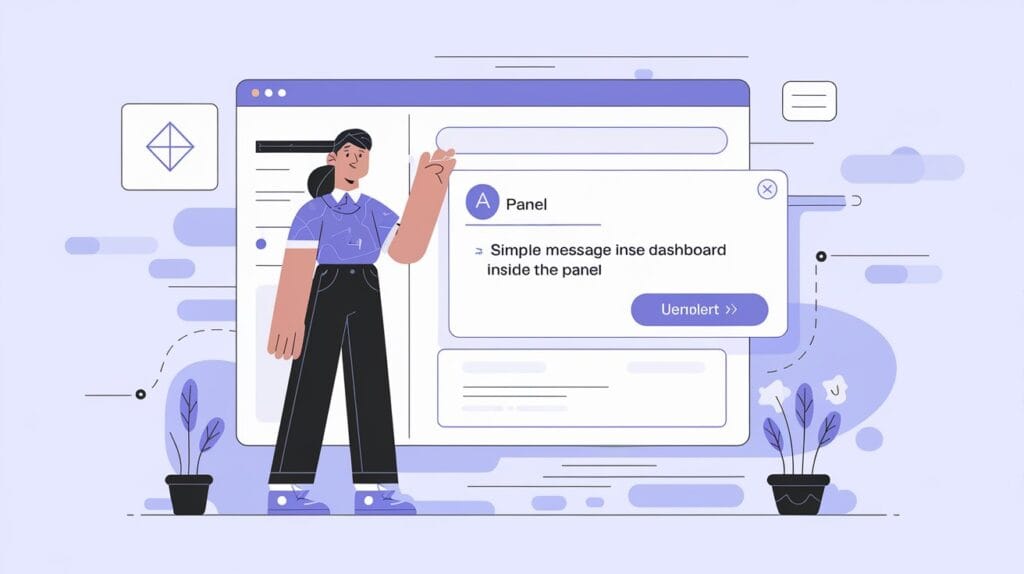
Basic Usage Example
Below is a simple code snippet that shows how to use the Anchor Panel.<template>This example creates a collapsible panel with a header and some content. The
<Panel header="User Dashboard" toggleable>
<p>
Welcome to the user dashboard. Expand this panel to view more details about your recent activities.
</p>
</Panel>
</template>
<script>
import Panel from 'primevue/panel';
export default {
components: {
Panel,
},
};
</script>toggleable attribute ensures the panel can be opened or closed as needed.
Best Practices for Using Anchor Panels
Keep it Simple
Anchor Panels should be used to organize related content into logical sections. Avoid overloading any single panel with too much information, as it may overwhelm the user.
Test Responsiveness
Always test how your Anchor Panel behaves on different devices. Ensure the layout remains smooth and content doesn’t break across smaller screens.
Use Clear Labels
Make sure each panel header is descriptive enough to tell users what they’ll find inside. This improves user experience by reducing guesswork.
Use Cases of Anchor Panels
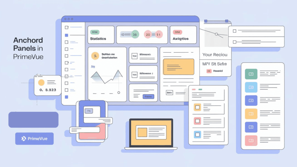
Anchor Panels are incredibly versatile and can fit into various parts of web applications. Here are a few common use cases:
Dashboards
- Dashboards require efficient content management. Developers can use Anchor Panels to section off various statistics and widgets, allowing users to collapse the panels they don’t immediately need.
Navigation Menus
- Anchor Panels make great collapsible side menus, improving navigation without taking up too much space.
Forms and Surveys
- Breaking down forms into multiple panels ensures users aren’t overwhelmed by too many fields at once. This also helps improve conversion rates by making long forms appear shorter.
Content Organization
- Anchor Panels are perfect for organizing blog posts, product descriptions, or FAQs. Readers can choose to expand only the sections they are interested in.
Also Read: How to Find Hidden Stuff on iPhone
Conclusion
The Anchor Panel in PrimeVue is a powerful tool for content organization within modern web applications. With its ability to collapse, dock, and adapt to different layouts, it offers a seamless user experience across devices. Developers benefit from its customization options and ease of implementation, making it an essential component for complex dashboards, forms, and navigation menus.
By adopting the Anchor Panel, you can significantly improve the usability and appearance of your web applications. Whether you’re designing a dashboard, navigation bar, or form, this feature ensures your content remains well-organized and accessible. Now is the time to elevate your content organization by integrating the Anchor Panel into your next project.
Frequently Asked Questions
An Anchor Panel in PrimeVue offers docking and collapsible functionality, meaning it can be pinned to the sides of the screen and collapsed/expanded based on user interaction. Regular panels, on the other hand, primarily serve as static content containers without advanced interaction options like docking or toggling.
Yes, the Anchor Panel supports simple animations for smoother transitions when expanding or collapsing content. This enhances user experience by providing visual cues as sections open or close.
To ensure an Anchor Panel is responsive, use PrimeFlex CSS utilities or media queries. This allows the panel’s layout to adapt seamlessly to different screen sizes, ensuring optimal performance on both desktop and mobile devices.